Within a few years, we’ve seen several Google ranking factors.And at some point, you must have wondered:
How well does one SEO tip work over the other or is it even effective especially in 2018?
To further break it down,
Is responsive web design responsible for good Google ranking?
Yes, it is!
According to a Google report, billions of searches are made in a day using smartphones than on computers.
Here’s the deal:
The responsiveness of different versions of your website can either rank
your site high on Google, improve its rank steadily or push it farther
away from top pages.
Why is that?
In a Google update in 2015, the responsiveness of a site is a huge ranking
factor and a responsive design is Google’s recommended design pattern.
But then,
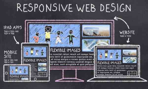
A website is said to be responsive when its pages can be viewed
conveniently on several devices. Devices such as PCs, smartphones and
tablets .
On a responsive site, its pages restructure
to the best view depending on the device it is viewed from, thereby
making it friendly for every user irrespective of the device used in
accessing the site.

Most webmasters have an easy to use and navigate web version of their website, but not many have a responsive view on mobile.
A website cannot be said to be responsive if it takes as much time to load its mobile pages as it takes to view its web pages.
If it also takes mobile users twice as much time as it would take desktop
users to access content on the site due to their smaller screen, then
the said site is not responsive.
Here’s what it looks like:
You’re using a Blogger or WordPress template that still displays the zoom view
on the site’s mobile view? then you do not have a responsive website.
With an increasing number of people using smartphones and tablets to browse
in 2017, it is very important that you have a web design that is
responsive on any platform.
By the way, why do i need a responsive site?
Importance of Responsive Web Design 2017
Here are the reasons why you need a responsive website in 2017.
Before we proceed:
Let’s
pretend you’re already ranking on Google for your optimized keywords,
but what happens to a user that lands on your site and has difficulty in
navigating through its pages.
I’ll tell you what:
They’ll
most certainly leave faster than they arrived not unless your site is
the only one they can find that particular content on; which isn’t
likely.
This impacts negativity on your site by increasing its bounce rate and trust Google bots to rat you out,
“Hey,
this guy’s blog doesn’t have great content afterall, We might as well
place it on Page 2 of our search engine results pages”.
Now you see how that turns round to bite you in the ass?
Other than responsive web design we also have an adaptive and separate mobile site design.
An adaptive design uses the same URL but a different HTML version to display a particular site on different devices.
On the otherhand,
A
seperate mobile site uses a different URL and an HTML version to
display the site on different devices. Its URL usually has the
structure, mDot site.
But why does Google place more emphasis on a responsive web design leaving those two guys hanging?
Stay with me:
A responsive web design is Google’s preference for the following reasons:
- It doesn’t waste Google resources where Google bots have to go back
and forth to load different versions of the same site and also index
different versions of a particular site. - It gives enhanced user experience with its easy to navigate interfaces on the same site.
- There is minimal SEO difficulties like bad redirects.
Still uncertain if your site is responsive or not?
Before we proceed,
Use the Google Pagespeed Insight tool to evaluate your site.
The
result of the test will help you determine if you have a website that’s
partly responsive and requires little work to make its pages more user
and search engine friendly, or a website that needs serious attention.
After
discovering your pagespeed score, how then can you improve the
responsiveness of your website? The guidelines below will help improve
the responsiveness of your site.
How to Make an Existing Website Responsive
To build a responsive website requires and is not limited to the following:
1. Page speed:
Believe it or not,
A fast page is one that can load within one second.
Ya right! Like that’s possible.
Well, you can strive to make yours load around that given time even if its not exactly 1 second.
How’s that?
Use minified scripts and compress your post images by
- Compressing images using compressor.io and compressnow.com
- Compressing Scripts using refresh-sf.com
For users of the Blogger platform,
- Use the original sizes of images uploaded instead of automatically resizing by choosing small, large, extra large sizes.
- Upload your images to one source like blogger’s image storage called
Picasa. When your page’s images are stored on different platforms, then
it’ll take more time to visit each resource and get them.
These will improve your page loading speed significantly.
2. Bounce rate:
A faster site and one that is easier to navigate will definitely have a lower bounce rate.
What am i getting at?
Reduce your site’s bounce rate.
The first step:
You can easily do this by using related content widget and popular post widget across different views of your site.

Secondly,
Employ internal linking of related post to give your visitors a simple way to go through several pages on the site easily.
Keep
in mind that your bounce rate will be unaffected if your site’s content
is loaded with crap because visitors will always leave.
You might want to skip this step😉
The bottom line,
Coupled with these widgets listed above, your content matters as well to reduce your site’s bounce rate.
Most dissatisfied visitors will not go through another page on a site whose landing page didn’t have much to offer.
3. Blocked CSS or JavaScript.
You must allow Google
bots to view JavaScript and CSS files on your site by uploading it into
the site’s template itself instead of an external storage or third party
site.
If your site has several blocked CSS, the google
pagespeed tool will point it out to you showing the exact Javascript
URL whose resource is blocked.
How can i resolve this?
For users of blogger platforms, to unblock Javascript
- Copy the URL of the Javascript
For Example:
https://ajax.googleapis.com/ajax/libs/jquery/1.11.0/jquery.min.js
- Then Goto your blogger template
- Use Ctrl + F keys to search for the URL
- When found, add defer=’defer’ to that line of code. The image below shows you where exactly it should be inputted.
- Save your template.
The defer tag you just added ensures that the script only loads after all the page content has loaded.
Another Option you can implement is,
- Copy the Javascript URL
- Input the URL in a web browser and search for it.
- You will see a bunch of codes for that Javascript or CSS, copy it.
In your template,
- Search for the Javascript URL you copied from the pagespeed tool,
- Use refresh-sf.com compression tool to remove comments and excessive spacing from your code.
- Replace the Javascript URL with the entire code you copied when the url was accessed.
You can also do the same for your css files and encase them within the <style> </style> tags.
In conclusion:
Google
prioritizes websites with responsive designs because it wants its users
to have a good reading experience hence, you should always choose a
mobile friendly template for your site in order to avoid a drop in your
rankings.
But then,
Although Google is
giving preference to websites that are responsive, those that use AMP
pages that loads faster than a responsive design get even a higher level
of preference. This means that an AMP page will load even faster than a
page using responsive design.
About the Author:
Grace Joseph is a blogger at techlass.com where
she shares her ideas on SEO, mobile phones reviews and, blogging tips
and tricks. You can visit her site to connect with her.


Hi Grace,
Great Article you've put up here.
The World's becoming mobile already and Web/Blog Owners should do all necessary to make their blog mobile friendly or responsive.
I personally hate to navigate all through before am able to get what I desire on a Website.
It lets me do two things which would definitely affect the website.
1. I leave Immediately and record a Bounce Rate
2. I leave and never come back. You definitely don't want to come back to a site that gives you tough time in navigation and others.
Nice Post once more and would be tweeting this with my followers.
Hi Prosper,
Thanks for the kind words.
I most especially note the URLs of sites with low quality content in my mind to avoid revisiting twice.
This might be the same for some people and as you've state, dfficuty in navigation determines how long you spend on a site an if you'll return.
This means that more consideration has to be given to a site's Bounce rate and I'm afraid at the moment, this is not the case.
Hey Grace,
How accurate is the bounce rate reading on Google Analytics?
Your words don't lie.
While I was reading this, I wanted to catch your winch so I changed the view of my mobile phone to landscape just to see if NobleLoaded is responsive..
Mehn.. you got me. Your blog was like "gerrahere mhen". We don't preach false doctrine…. hehe. Am glad your blog is responsive
Personally, I would have opted in for AMP but my little finding told me that Java scripts don't run on AMP.
That implies that Google Ads won't be showing…
Though I've heard of its benefit but, Bros as regards, AMP, I nor do again oo…. Maybe some other time (I'll think about it)
On Google Page insight, my blog scored about 56 on mobile and 60 on desktop…
I'was advised to block some css and java script but I guess I was feeling too lazy to do the necessary fix.
Learnt one or two things here that has opened my eyes… I ain't playing with my speed test again…
Am heading to my blog to do the needed fix ASAP.
Thanks Grace.
I see you're doings….. (hehe)
Lol, your comment is funny,,, yeah it's responsive. Please go and set it up.
Hope to see you here again.
Responsive design is a very great factor that determines a blog seo ranking. Very nice and detailed post share here Grace!
And it's been a very long time!
The idea of making my blog fast matters a lot to me, I have read multiple online materials but not much helpful, now I will go try use the compressor scripts. Thanks for the post.